As a UI/UX designer, you know how difficult it is to constantly keep those creative juices flowing. You may be asked to consult on a design prototype, provide UX insights on a product requirement document (PRD) or brainstorm on the best graphic design image for a page. There may be days when you’re doing all of these things at the same time! Phew!
For all this and more, one needs a steady dose of creativity. You may look for inspiration through design boards, design books or the work of other designers. However, there are various ways in which UI/UX designers can ramp up their creativity through their daily tasks.
Let’s start with breaking down the components of creativity. If we have to put creativity into boxes (pun not intended), Adam Jorlen has proposed five types of creative thinking:
- Divergent Thinking
- Lateral Thinking
- Aesthetic Thinking
- Systems Thinking
- Inspirational Thinking
In this blog post, I’m going to focus on the first and the most important type of creative thinking: Divergent Thinking
Divergent Thinking is an extremely handy skill in a UX designer’s arsenal. It is the art of exploring as many options/solutions to a problem as possible. This is absolutely essential when designing strategies, services and experiences for digital businesses as it promotes flexibility, fluency and originality.
Here are top 5 science-backed ways to apply divergent thinking in your work:
- Use Idea Quotas:
The next time you are designing ideas using wireframes, sitemaps, process flows or storyboards, create artificial obstacles. Hurdles boost our brainpower and force us to innovate.
A study done in 2015 by researchers at John Hopkins and University of Illinois showed that when we are faced with limitations, our mental energy is directed to acting more resourcefully. Putting these creative constraints to use is the key to improving our divergent thinking. It can also be extremely useful in creating UI mockups and prototypes. Here’s how:
Time constraint: One way of harnessing the power of the creative constraint is by creating your own time constraint. Set a timer for 15 minutes and generate as many mockups of an assignment as you can.
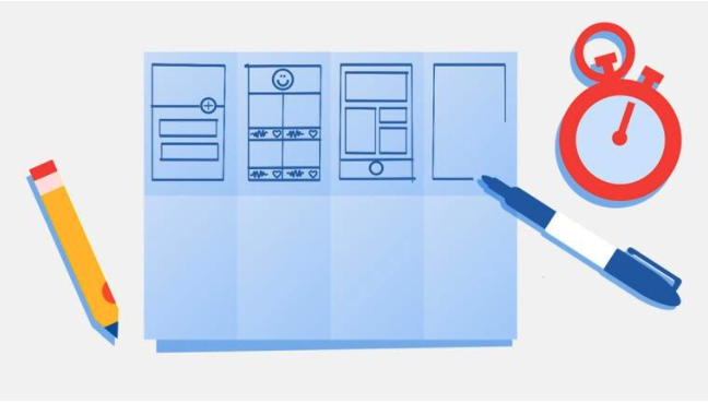
Crazy Eights: Pick an existing app design or web design and sketch 8 variations of it in 8 minutes. A few challenges to begin with: design different web designs for print advertisements, design variations of e-commerce sites for a supermarket or even rethink UX strategy for an app you use daily. Use the crazy 8s like a pro and you’ll be the master divergent thinker before you know it!
2. Brainstorm the User Experience:
Divergent thinking plays a big role when you have to understand user experience or conduct market research. It’s great when you want to understand your user requirements for your digital assets as you can look at multiple possibilities.
A great way to see divergent thinking in action is to visualize your customer’s journey and pain points. This helps frame the problem from the customer point of view.
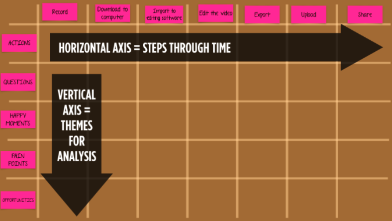
User Journey Maps: A user journey map is an illustration of the steps a user takes as they interact with your product/service. Brainstorm all possible variations of customer journeys that can possibly occur. Identify user actions, happy moments that may occur, pain points a user experiences and possible opportunities. This helps identify potential unnoticed touchpoints in the current journey and design experiences at each stage of the interaction.
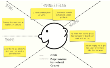
Empathy Mapping: Using an empathy map, put yourself in the user’s shoes and view the world (and your product) from their eyes. List down their thoughts and feelings by understanding their worries, aspirations and preoccupations. See what they are seeing by knowing their environment and hear what their hearing by learning what their peers say. Put your thinking cap on and list as many thoughts and feelings. List as many statements of what they are saying and hearing and what they’re seeing around them.
- Engage in Mind Mapping:
One of the most significant responsibilities of a UI/UX designer is to develop and conceptualize design strategy for the brand. Using mind maps, designers can generate a variety of ideas and engage in freewheeling without limitations.
Cognitive mapping:
Cognitive mapping is a free-form mapping, representing a person’s mental model of a concept. It will help externalize knowledge, refine thinking and stimulate thinking along new directions. It also helps the designers identify themes across different concepts and give rise to new connections.
Mind mapping:
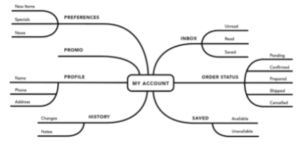
Mind mapping is a great tool to engage in freewheeling. You can let those creative spirits fly as you branch out the different aspects of a UX design. It helps you think without limitations and question known ways of doing things. You can brainstorm as a team to create the mind map and innovate once the map is ready.
Concept Mapping
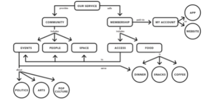
Concept mapping takes mapping to a whole new league as they are more complex. They bring in multiple perspectives, helps understand the concept and relationships in between the concept better. This kind of mapping links one idea with another and analyzes the problem from different lenses.
- Think Differently:
Apart from high-level design strategy, a designer needs to deep-dive into the nuts and bolts by designing UI elements and tools such as navigation menus, search boxes, tabs and widgets etc. Many divergent thinking strategies are a brilliant fit in such situations.
Question the obvious: Look at some usual icons, tabs and widgets and ask whether this actually needs to be here.
Challenge: Break free from the limits of traditional thinking. Assume that the current ways of thinking and working aren’t the best and not serving us well, in what ways would you design UI elements?
Alternatives: When we get used to a certain way of doing things, we don’t look beyond to find better ways of doing things. When looking at an issue, think about alternative ways that those being used.
Random Entry: Make a surprise entry with a splash of colour or an additional button. Bring in unconnected input to open up new lines of thinking.
Eliminate: Think in terms of removing, not adding. What can designers do to eliminate problems and inefficiencies? What steps can be eliminated?
- Design for Extreme Users:
Fool proof your UI elements by designing them for extreme users. Elements such as CTAs, banners, page layouts, page designs, page flows, and target links are usually designed keeping the majority users in mind. When you design for the Extreme Users such as the elderly, children below 12 and people who are generally excluded from the mainstream category, you might identify perspectives that others generally miss.
You can also look at your problem from the lens of someone who lives alone or someone who lives with a huge family. Doing so might help you understand how they interact with technology. Need a fun twist? Look at the product from the lens of someone who’s using a smartphone for the first time 😉
Are there any strategies to stimulate divergent thinking that you use in daily practice? Let us know in the comments below!
For more awesome content from our other mentors check out our blog (www.gleac.com/blog). Visit at our website (www.gleac.com) and also for our NFTs head on over to Lovely Humans (www.lovelyhumans.io) to learn more!

